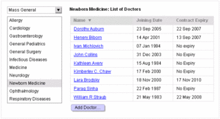
You must have seen and experienced many enterprise software applications that have tree views as primary navigational strategy. These application interfaces mimic the system’s underlying data structure for primary navigation. The underlying data structure may be highly efficient in organizing, sorting, and finding the data by the computer. However, it fails to help users find and manipulate data. It only helps users get frustrated and irritated instead.
A big semantic distance is the cause of this difference. Semantic distance can be described as the difference between conceptual model of the user and the system. High semantic difference makes navigation in these applications cumbersome, awkward, and highly inefficient for novice as well as expert users.
In a multi-hierarchical, deep navigation, and complex workflow based software applications, it is common for users to forget the hierarchy of the element they were working on. Tree view does not solve problems, it, in turn, creates too many problems to solve. As tree views remain an important navigational widget in several interfaces; let’s try to solve the “tree view as navigation” problem.
Step 1: Remove Tree View
“How can I do that?” If this is your immediate reaction, you definitely are a weak hearted development manager. If you have a strong heart to reap long term gains, I am sure you will stay here.
There are two recipes to remove tree view:
1. Just remove it – My recommendation
2. Reduce it, and then remove it – For the development managers who are really not convinced about removing tree view.
Let’s go through these steps to reduce the tree and to help users find things at the right place.
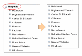
a. Remove the root node: Typically, the root node of a tree is an element that is needed to hold the tree together – it does not have any significance in the project. It will typically be named project, or workplace, or root node, or root, or something else that does not make any sense to anybody.
By removing the root node, you will gain about 30 horizontal pixels and one less click each time user tries to find something. User will gain by less horizontal scrolling and far fewer clicks during the day (my Carpel-tunneled hand is already feeling better!).

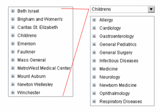
b. Freeze top-levels: In our experience, a tree view that have more than 2 types of nested artifacts confuse the users – files in a folder or folder within a folder is okay, but sub-process in a process, process in a business location, business location in a business, and a business in an enterprise in NOT okay - it increases cognitive load on the users and thus confuses the users.
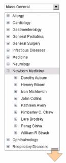
Most users never deal with top level tree nodes, they work with nodes that are somewhere at the bottom of the hierarchy. Most users never change the top level nodes. So, it is wise to move the top level nodes outside the tree structure. These artifacts now become the default for a user throughout the life-cycle of the usage of application – users never have to re-select the default one – the application understands this default for all activities that the user performs. However, in some cases when the user wants to change the top level artifact, it needs one extra click.
Making one or two levels of the tree as default for users will save a lot of confusion and reduce the tree dramatically. Again saving horizontal scrolling, fewer clicks, and less confusion.

Remember to show the defaults always (and way to change them). These artifacts can be shown in dropdown boxes placed above the tree. Alternatively, they can find some place in the header of the form.
c. Keep Nouns, move adjectives and verbs: Many a times, a tree view in an enterprise application contains artifacts like files, actions, tasks, etc. This type of hybrid scheme is confusing as it creates huge semantic difference. To understand what can be a part of tree and what cannot be a part of tree, a tree view must mimic colored marbles in a glass jar. You must keep only artifacts that are nouns and remove artifacts that are either verbs or adjectives.
Move properties (adjectives): You understand that some marbles are small, some are big, some are spherical, some are like footballs, and some are transparent, while others are colored. These are all properties of marbles and properties are not marbles themselves. However, in many tree views, we see that properties are shown as tree nodes. Remove property nodes and move the content to their respective parent nodes.
Move actions/tasks (verbs): New Marble, New Marble Color, and Remove Marble Shape – these are also oft seen tree leaf nodes. These cannot be a part of the tree structure. Move them as a part of the parent leaf node.
d. Move terminal leaves to content area as list: This exercise must be done after you have put your nouns, adjectives, and verbs in place. Terminal leaves are not grouping elements – they cannot be further divided. A further division is only possible if you are showing their properties. Examples: Emails, files, etc.
Move terminal leaves out of the tree and place it as a list or table with properties in the main content area.


e. Remove links to log files, property files, etc. These are never required; however, if it is necessary to show them, do not increase one node in the tree.
f. Change marketing names to generic names: Users really get confused with new names of usually understood artifacts. One company named its checking account as “ActiSave,” while another trademarked business policies as “QuiRule.” And, poor users had to learn their vocabulary again – thanks to marketing guys. Change all marketing names to generic names.
I am sure, after completing the above tasks; your tree would look like a list or a shrub that is just 2-3 levels deep. Are you still in love with the tree you nurtured for so long?
Step 2: Provide an overview screen
Any application that depends on a tree structure for primary navigation cannot be considered as full application. This application is, at best, some forms somehow stuck together within a tree over a period of time. The user is left alone to understand the complexity and make all navigation decisions – whether or not they are right.
In enterprise software applications, the first screen users hit upon is a welcome screen – the only piece of data on the screen is your name – wow! Now you know that the software has recognized you correctly. Some applications go a long way and ask you to select a project (top most level tree node) from a very long list containing “one” project. Couple of pieces of advice – chuck the welcome screen and throw away selecting first level of tree node. Give users what they want to do by using an overview screen.
An overview screen is a great way to upgrade a bunch of web-based forms to a real application (and get rid of the stupid tree too!). To fulfill users personal and professional goals, a real application not just holds a bunch of forms, it helps users (at all times) to begin and complete their tasks efficiently. The user is guided through the task using appropriately placed markers and signs. The overview screen is used to:
a. Guide first time users of the application: First time users of the application must be guided to setup the application quickly so that they can test some major tasks. Guided help in completing early tasks will make users very comfortable with the software and also help users establish a good rapport with the software. This will ensure that there are few early dropouts and far more recommendations.
Many early tasks are dummy tasks that users will never make use of – these will be used for learning and testing the software. Any help in removing the dummy tasks and data, will help users immensely.
b. Show the major tasks that can be done: List the key tasks that users can do using the application upfront. Listing of these tasks will ensure that users don’t search for artifacts first and then act upon them – it will ensure that users find the task first and then select an appropriate artifact.
c. Help users when they come back to use the application: Application is most used by repeat visitors, first time visitors are few are far between. The application must be optimized for repeat visitors. These visitors need to complete their incomplete tasks, start new tasks, find information about other elements while completing tasks, etc. On the overview screen, to help these repeat visitors:
Provide a list of incomplete or pending tasks: This list is critical for workflow based enterprise software applications. Without this list, users will have to go through tree hierarchy to find out what tasks are either assigned to them by others, or automatically by the system, or tasks that were saved for later by the users themselves. In this list, provide the name and basic identification information of the artifact, the type of task that is due, the date that is due or overdue, and links to finish the task.
Provide a task history or screen history list: Typically, there are few fresh starts – at most times, users try to finish or continue tasks that are pending or were saved for later. A linked task history list will help users continue working on artifacts or tasks that they were working on last time.
Step 3: Predict user behavior
There were many Java development environments, but IntelliJ and Eclipse revolutionized Java programming. The reason is simple, they facilitated user behavior. If a file was changed by the user, the user could immediately see and change all dependencies – they did not have to compile the code to know if there were any problems. Result – few compilation cycles, very early detection of problems, facilitation to solve problems, and therefore good user productivity (happy users).
In workflow based enterprise applications, behavior of users can be predicted with fair degree of accuracy. This can be done by understanding the current user practices, organizational practices, and through meticulous contextual inquiry and observation techniques.
As mentioned earlier, applications that use tree view as primary navigation cannot be considered as web applications, they are just a bunch of forms sewn together. To make it an application, the application must predict user behavior and facilitate that behavior.
Step 4: Provide an efficient search mechanism
Having said that users are predictable, we understand that many times user interface designers are unable to predict what users are going to do next. There are situations that users must find old artifacts to refer to or other such tasks. In situations like these, it is important to support user activities by helping users find the required artifacts or information.
Many a times, the search information that the user provides the search engine is sketchy – contains peripheral information, contains information about properties of the artifacts, or contains information about the relationships of the artifact. The last thing you expect a user to remember is the name of the artifact (that too with correct spelling and case!).
a. Provide a text field and a search button. Avoid categorization of search criteria here. Search everywhere – not just in names of artifacts.
b. Search results must be shown with artifact name, description, and key relationships of the artifacts.
c. Pardon and help users who cannot write correct spellings or are case handicapped.
Step 5: Provide a way to bookmark places
There are places in an application where users regularly visit. There are also users who seldom use the application and when they use they need to reach some places quickly – not through the navigational maze. A way to bookmark a place is a good way to get users going pretty fast. Provide a one click way to bookmark the current page and provide a link to quickly see the hyperlinked and alphabetically organized bookmark list.
And, don’t hesitate to show tree view too
The tree view may not be the navigational metaphor, but in certain circumstances it may be necessary to show a tree view to facilitate understanding about the relative grouping. You can show a hyperlinked tree view too if needed. Remember to hide it again as fast as the task is done.
